Visualizing AI Workflows
Understanding the structure and execution flow of your AI workflows and agents is crucial for development, debugging, and optimization.
This guide focuses on Junjo’s built-in Graphviz integration to generate static diagrams of your workflow architecture as you code, and touches upon the dynamic visualization capabilities of Junjo AI Studio.
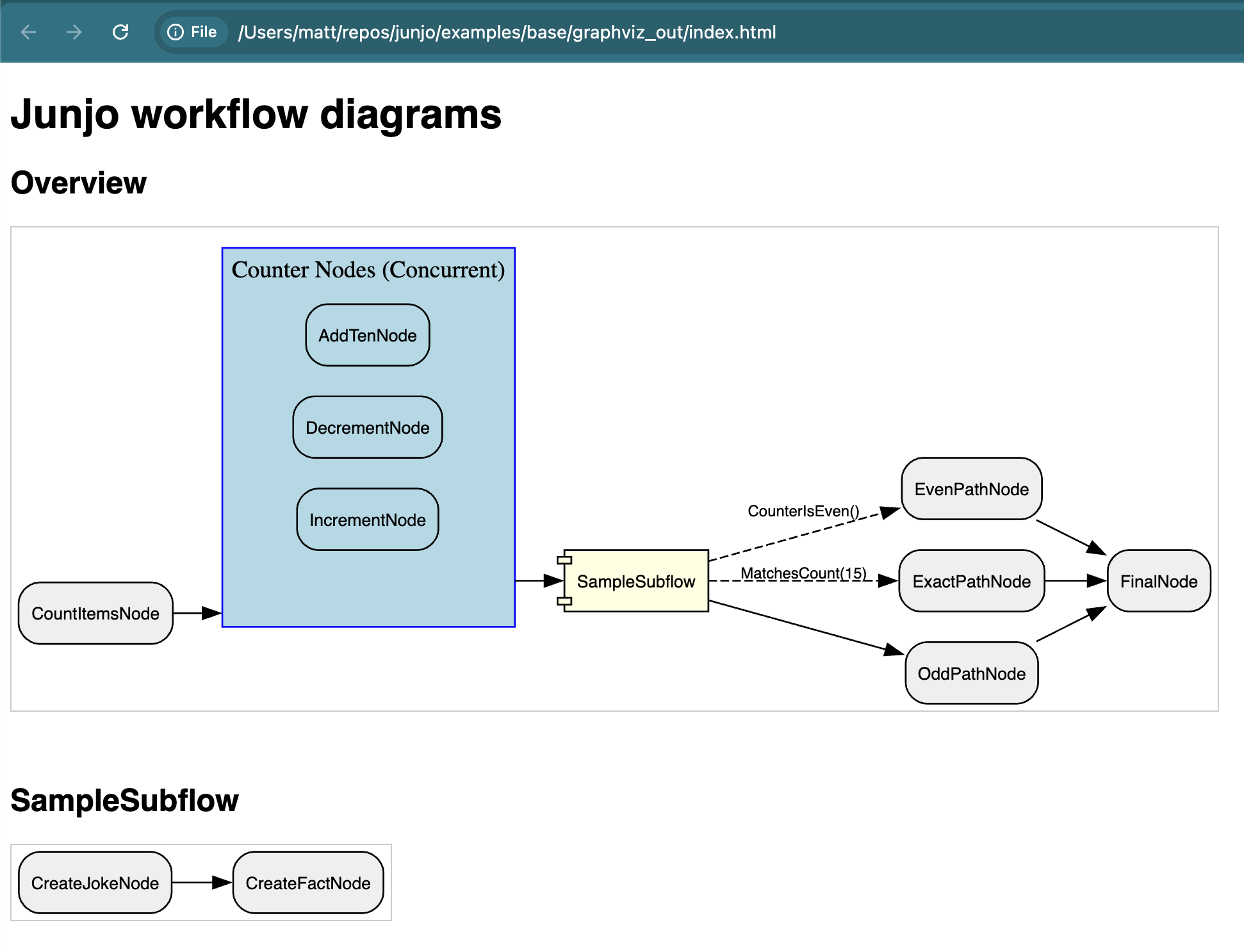
A screenshot of a basic Junjo Graph workflow rendered by Graphviz.
Why Visualize Your AI Workflows?
Complex AI systems, especially those involving multiple Large Language Model (LLM) calls, conditional logic, and concurrent operations, can quickly become black boxes. Visualization helps to:
Increase Development Speed: Quickly understand the structure of complex workflows, and how code changes affect the overall system.
Collaborate with Non-Developers: Share visual representations with stakeholders who may not be familiar with the codebase, making it easier to discuss changes and improvements.
Enhance Documentation: Provide clear diagrams that can be included in documentation, making it easier for new developers to understand the system.
Clarify Architecture: See the explicit connections, dependencies, and potential paths of execution within your graph.
Aid Debugging: Quickly identify unexpected pathways, bottlenecks, or errors in graph logic.
Facilitate Collaboration: Share clear diagrams with team members to ensure everyone understands the workflow.
Improve Onboarding: New developers can grasp the system’s design much faster.
Support Eval-Driven Development: Visual feedback complements testing by showing how data and control flow through the system during different evaluation scenarios.
Understand Agentic Behavior: For more autonomous agents, visualizing the graph (even if parts are dynamically determined) helps in analyzing decision-making processes.
Generating Workflow Diagrams with Graphviz
Junjo can directly render your workflow graphs as images using Graphviz. Generate detailed diagrams of your main workflow and any nested subflows, including how RunConcurrent nodes are structured.
Prerequisites
Graphviz System Installation: Graphviz must be installed on the system where you’re generating the diagrams (e.g., your development machine or Docker container).
For macOS with Homebrew:
brew install graphviz
For other systems, please refer to the official Graphviz download page.
Python Dependencies: Install the optional
graphvizextras for the Junjo library. If you are usinguvand have apyproject.tomlwith these defined (e.g., in a dev or graphviz extra):uv pip install -e ".[dev,graphviz]"
Generating Assets
The Graph object in Junjo provides an export_graphviz_assets() method. This function will:
Generate
.dotnotation files for your main graph and each subflow.Render these
.dotfiles into image files (SVG).Create an HTML page (
index.html) that displays all generated diagrams with appropriate headings.
Example Usage
Let’s assume you have a workflow graph factory defined, for instance, create_sample_workflow_graph from one of the Junjo examples.
In this example, we create an execute a visualize.py script to generate the Graphviz rendered assets.
# Import the graph factory you want to visualize
from base.sample_workflow.graph import create_sample_workflow_graph

def main():
    # Every graph can execute .export_graphviz_assets() to generate all graphs and subflow graphs in a workflow
    # Creates .svg renderings, .dot notation files, and an HTML template to render the graphs
    create_sample_workflow_graph().export_graphviz_assets()

if __name__ == "__main__":
    main()
Running the script (e.g., python visualize.py) will create a directory graphviz_out containing the rendered assets.
Visual Elements:
Nodes: Represent individual processing units (your Python functions wrapped in Junjo
Nodeobjects).Edges: Show the directed flow and conditions between nodes. Conditional edges are typically styled differently (e.g., dashed lines with labels).
Clusters (for RunConcurrent):
RunConcurrentnodes are rendered as distinct clusters, visually grouping the concurrently executing nodes.Subflows: Subflows are initially shown as a single “component” shape in the overview graph. A separate diagram is generated for each subflow, detailing its internal structure. This allows for a clean, hierarchical drill-down approach to understanding complex workflows.
Dynamic Telemetry with Junjo AI Studio
For real-time observation and debugging of workflow executions, Junjo integrates seamlessly with OpenTelemetry. The optional, open-source Junjo AI Studio ingests these telemetry traces and provides a web interface to:
Visualize live execution graphs: See the path taken by a specific execution.
Step through state changes: Observe how the redux-inspired state machine is updated by each node.
Inspect inputs and outputs: Understand the data flowing through your workflow at each step.
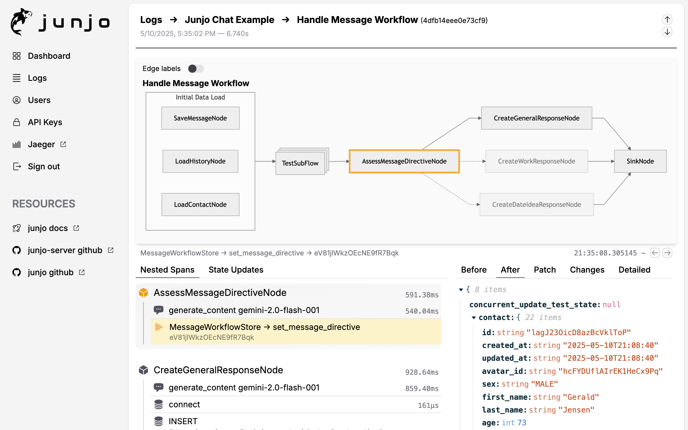
While Graphviz provides a static “blueprint” of your workflow’s potential paths, Junjo AI Studio offers a dynamic view of actual executions, making it an invaluable tool for debugging and fine-tuning your AI applications.
Note
Junjo remains decoupled from any specific AI model or framework. The visualization tools help you organize and understand the flow of your Python functions, regardless of whether they are LLM calls, database operations, or other business logic.
By combining static Graphviz diagrams for architectural understanding with dynamic Junjo AI Studio telemetry for execution analysis, developers can build, test, and maintain complex AI workflows with greater confidence and clarity.
—
- Next Steps:
Explore the Installation guide for installation and basic usage.
Dive into the API Reference reference for detailed information on Junjo’s components.
Learn about Eval-Driven Development for robust testing of your workflows.
Set up Junjo AI Studio Intro for dynamic telemetry visualization.